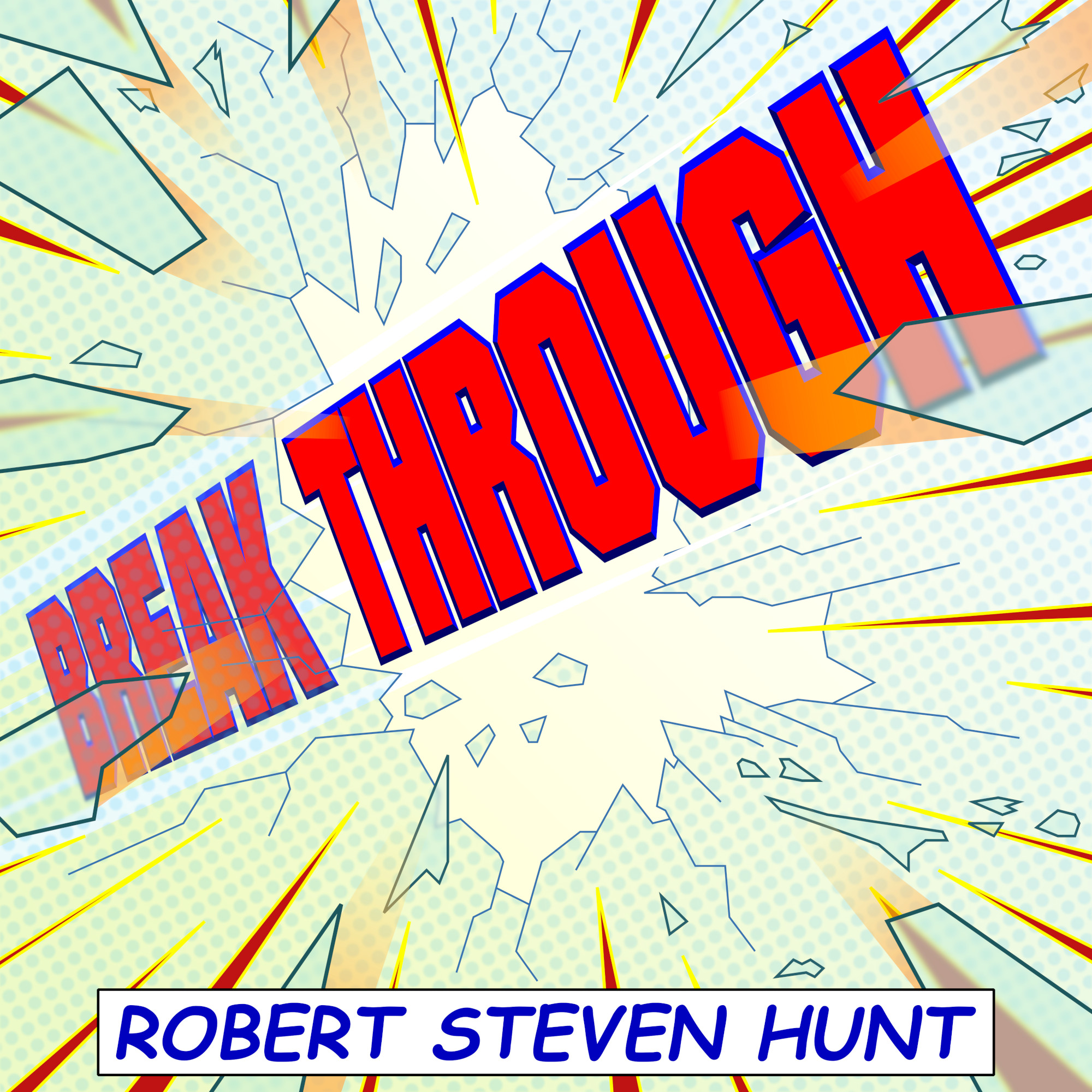
After a decade's worth (on-and-off) of collaborations with Steve Hunt, including Eagle Mountain, Edge of Time and Driftwood, I thought I'd got the measure of what sort of cover artwork he liked - but then I got the brief for his fourth album, Breakthrough, which came completely out of the blue: this time, apparently, we're going for pop art. Well, challenge accepted, so off I go to refresh my memory on the works of Roy Lichtenstein.
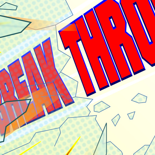
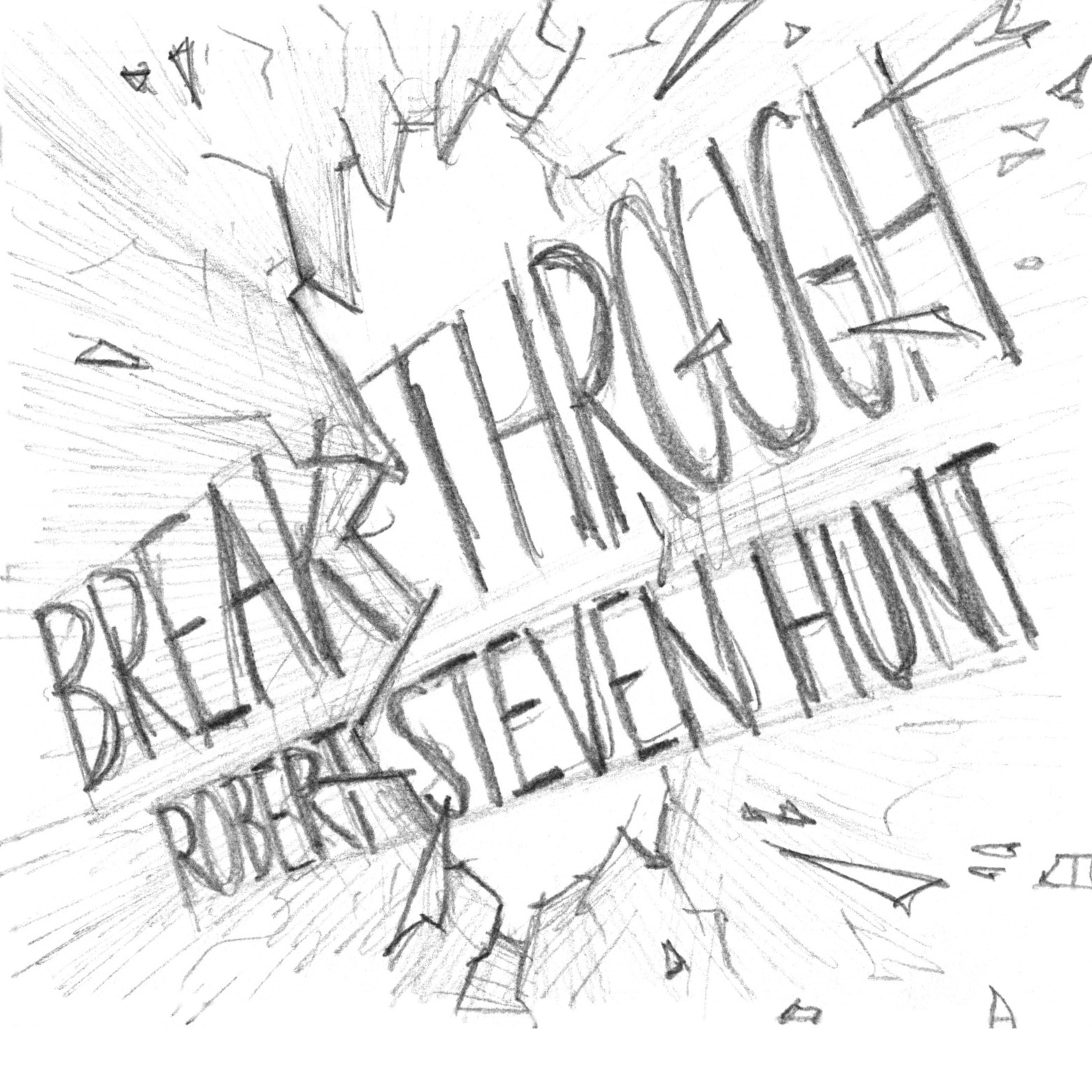
As has tended to be the case in our collaborations - at least the more recent ones - Steve had a very clear idea of what he wanted for Breakthrough. It only took me two quick sketches to visualise his description to his satisfaction (give or take one or two detail alterations, most notably the placement of his name), and from there on out the rest of the process was all about translating rough, monochromatic pencil into crisp, bold-coloured vector graphics... but without losing the energetic immediacy of the pencil work, which is sometimes easier said than done. Although my approach to colour in this project started off by referencing Lichtenstein and the comic-book panels which he had adapted, I found myself gradually moving away from their raw primary colours as the piece developed, not least because the translucency of the broken glass pieces as rendered in Inkscape naturally began to blend the colours together a bit in some areas; however, the palette remains centred around bold reds, yellows and blues.
A quick aside on the typography: yes, the composer's name is in Comic Sans. Yes, I'm fully aware of Comic Sans' reputation as the evil, tasteless font which should never be used for anything, ever. But it only gets such a bad rap because it so often gets used in contexts where it makes no sense - and right here, in a piece of graphic design which deliberately echoes a comic book (clue's in the name?), is one of those precious few places where Comic Sans actually fits. You are of course free to disagree, but I'm standing by my choice on this one... and I'm definitely using a very different font on the next project.
Breakthrough is far from being my first project with a fully-digital end result, but I do think it represents a new high water mark for me in terms of managing to invest a vector-based final article with kinetic impact, contrasting the much more formal construction of my previous vector designs such as Planted by Providence.