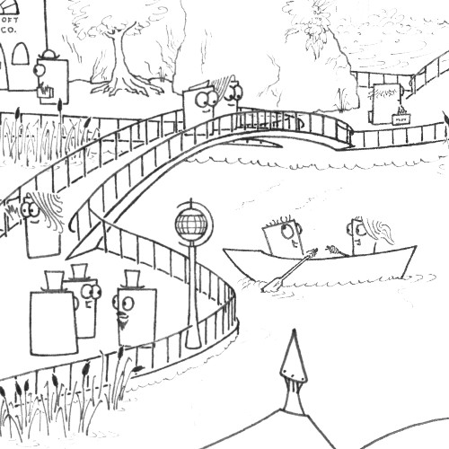
This was one of those projects (which seem to happen to me once in a while) which are born from the merging of two initially unrelated ideas. The final push came while I was drawing one of the sets for Papercuts - I try not to let it show, but there are actually a lot of technical restrictions which the animation process places on the artwork, for example the fact that everything has to be a certain size in order to fit in with the cutout elements (I won't go into that in too much detail here; if you want more about that then go to the Papercuts page and watch the behind-the-scenes videos). I started thinking it would be good to do some drawings in the same art style, but just for their own sake and without the extra technical demands of animation.
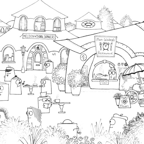
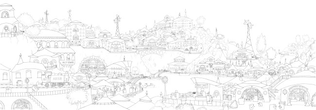
The other contributing idea goes back something like fifteen years. Somewhere around the age of 8, while looking at an Usborne book about ancient civilisations, I came across a picture of a row of shops in ancient Rome, and decided I'd have a go at drawing a street scene of my own: the resulting doodle (made of four A4 sheets crudely sellotaped together end-to-end) was populated by fictional creatures from my own imagination, and ended up being the first in a series of fifteen. Looking back years later, I can see so many flaws: most prominently the risible dialogue, the fact that I showed very little architectural inventiveness over the course of the hundred or so buildings which appeared in the series, the fact that some of the businesses that existed in the pictures just didn't make sense (why were there several clothes shops when the species running them didn't wear clothes, for example?), and of course the fact that I was only a kid and couldn't draw all that well. So, as I was starting to contemplate doing some non-animated Papercuts spin-off art, I also started to think about revisiting the 'portrait of a street' idea - the two notions merged together, and I ended up starting a picture of the high street in Desmonton, which I decided would be the nearest town to the Papercuts' residence.
The first drawing was done on a piece of A2 cartridge paper (taken from the same pad as the Arc Phase Variations), cut in half lengthways, with the two resulting pieces joined end-to-end to create a very long, thin strip to accommodate the awkwardly-shaped subject matter. Ironically enough, the perspective was still the killer: although each character and each building is rendered in a flat (or at least near-flat) style, I still need to be careful about their size and positioning in order to create an illusion of perspective and make the drawing hold together. Some buildings were initially sketched in a size-and-shape combination that made them look hopelessly out of proportion, and so had to be scaled up or down or else re-done elsewhere on the page. It was a good job I was roughing everything out in pencil first.
Desmonton ended up taking just over a year to complete, between April 2013 and April 2014. It features 30 or 40 different buildings (if you count the ones where you can just see a bit of the roof poking up among the skyline), and a population of exactly 150 (unless I miscounted, which is possible - challenge for you, maybe). Many of the businesses, particularly their names, are nods back to my first stab at the street-scene idea back in 1997 and/or to Yorktown Road, Sandhurst, where I worked at the time; in particular the large hardware shop near the centre of the picture is heavily influenced by - perhaps something of a tribute to - Kings DIY.
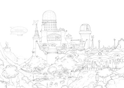
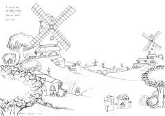
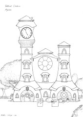
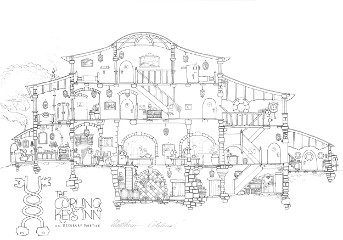
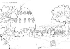
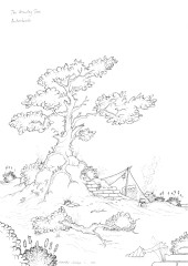
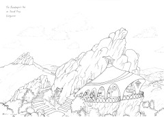
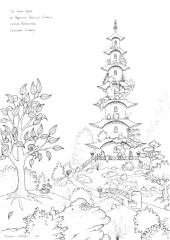
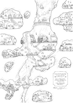
I started work on a second major Papertowns picture, titled Lodewater, not long after finishing the first one; as of October 2014 I'd got a fair proportion of the image roughed out on copier paper, but it took a lot longer before I got round to starting the final ink version on cartridge paper. I hopelessly failed the challenge to finish this one in less than a year, partly because it turned out to be even more complex than its predecessor, partly because I got distracted along the way doing a number of other, smaller drawings in the same style - 'A view of the Old Milling Country, Shire of Sussorts, East Linia' and 'Tebblewell Clockhouse, Hoyleshire' (both A4 size) and 'The Curling Keys Inn, nr. Beckbury Mortice' (A3) - and partly because I had this nagging feeling that something about Lodewater just wasn't working.
Eventually, in summer 2017 (3 years after starting!) I realised what was wrong: I'd overdone the perspective, and before you got too deep into the background everything was already too small to see any detail or character. I kept the foreground as it was, and adjusted the size of some of the mid-foreground buildings to start fixing the perspective, then transferred that lot onto cartridge paper and inked it, before taking a photocopy so I could sketch a completely new background half into the now-empty space. It only took another year-and-a-bit after that before I finally worked out the last detail problem, put the last bit of ink on the page, and called the project done after a total production time of almost four-and-a-half years.

